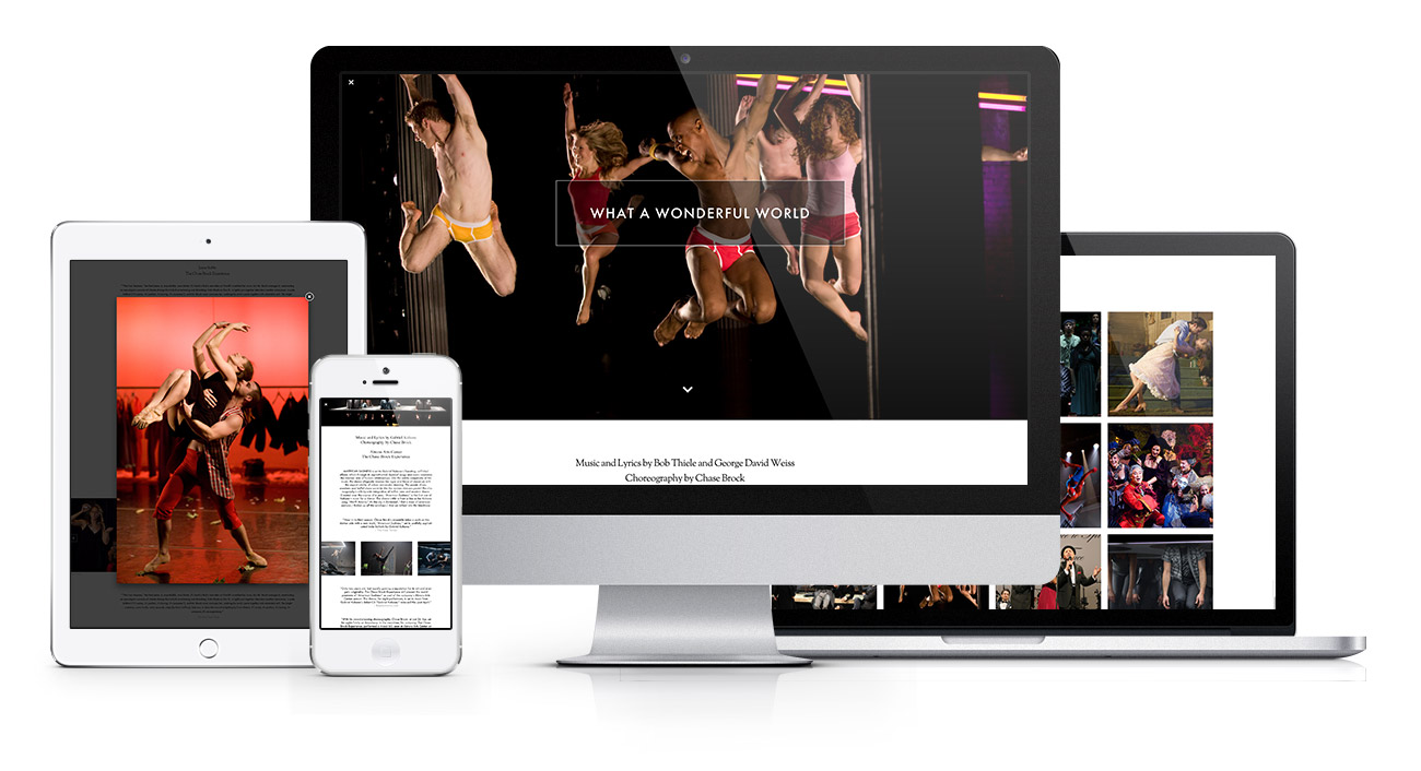
Chase needed a radically different approach to his site redesign, and he called on me to achieve it for him. His goal was to have the site be as minimal as was physically possible while still representing the breadth and array of work he has produced at his young age. He didn't want the site's design to muddy the waters and get in the way of the work itself.
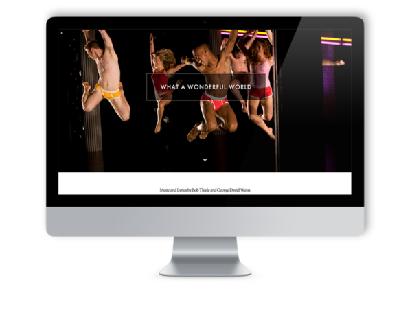
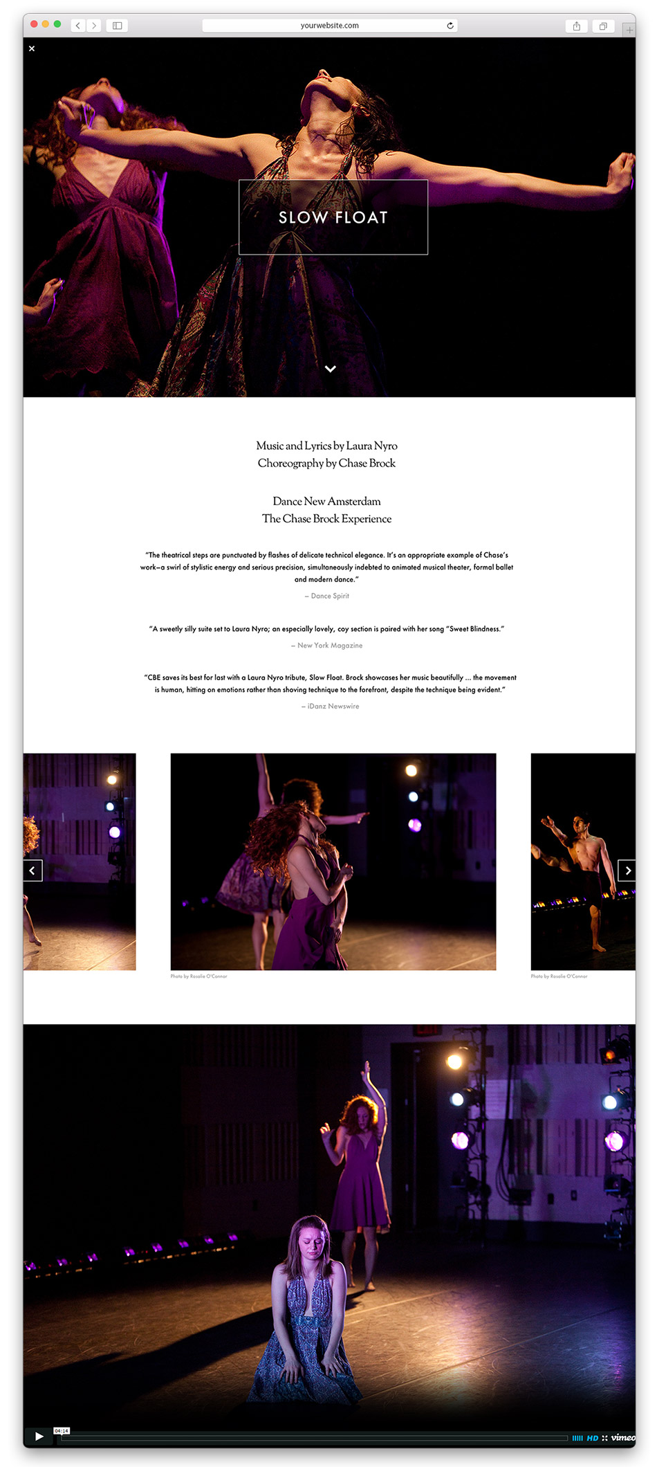
The answer was an extremely minimal home page grid that opened into a horizontally scrolling gallery for each project in the portfolio. With images, video, and a few stellar review clips, the essence of the piece is clearly and efficiently communicated.
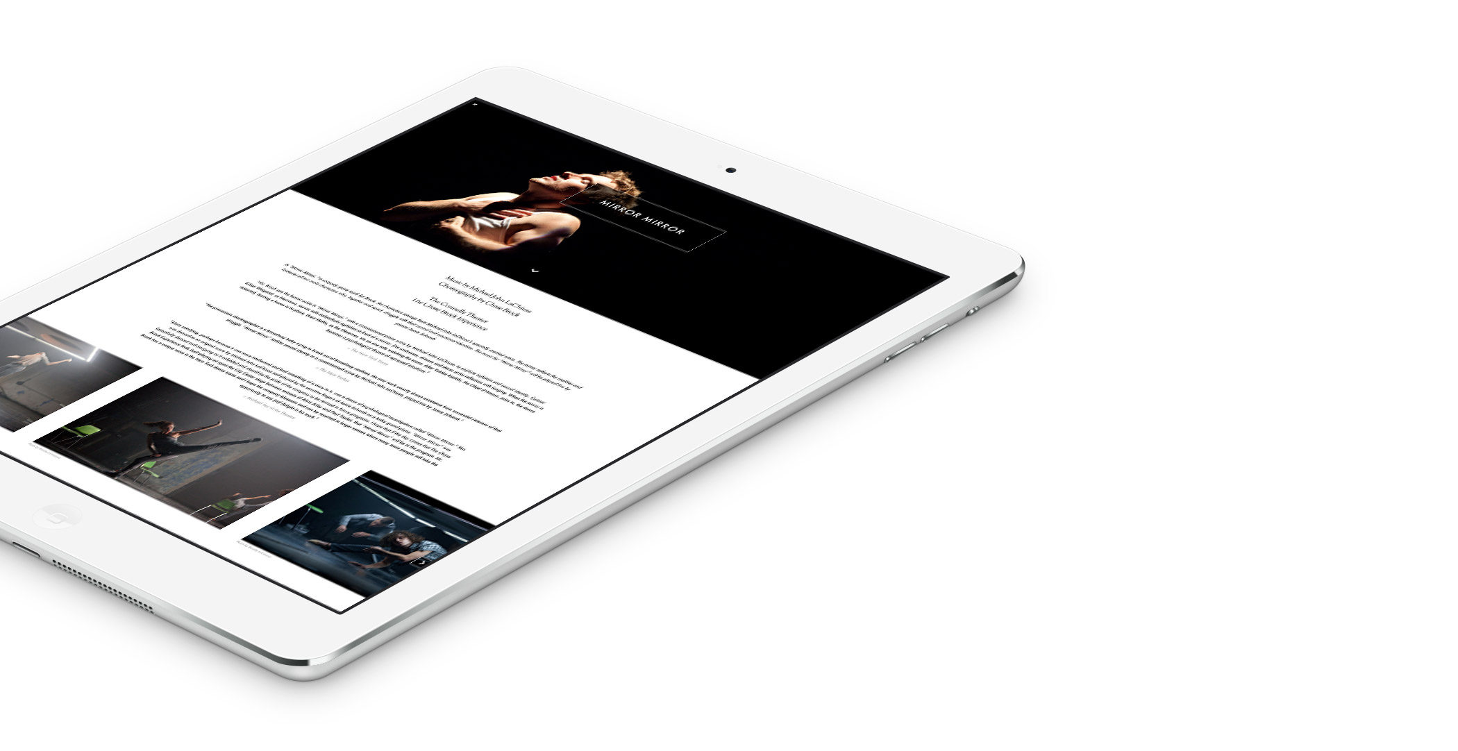
fully responsive
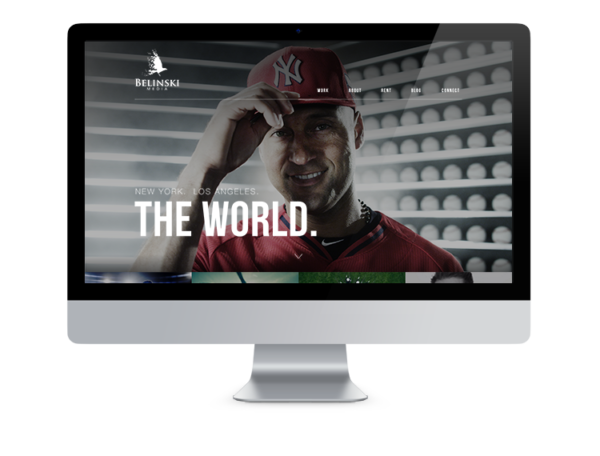
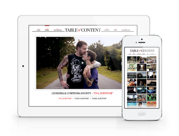
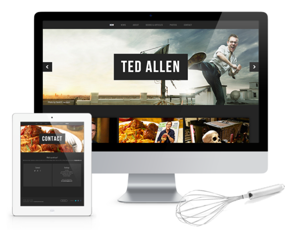
An adaptable �design layout that adjusts to all screen and device sizes, from portrait orientation on a phone, to landscape on a large display screen.�
embedded vimeo
An embedded Vimeo Pro portfolio lets the client quickly and easily update video content throughout the site within minutes.�
easily updatable
All the content is aggregated through custom PHP, allowing for the client to update their site through a wordpress editor in a few clicks.��
